Cavanagh Art Diary
L I N E S   T H A T   L I V E
  • Home
  • Info
  • Blog
  • Links
  • Contact
  • Go to Cavanagh Art

My TwitterArtExhibit 2016 entry

2/11/2016

0 Comments

 
This afternoon my entry to the TwitterArtExhibit 2016 in New York city was entrusted to the postal service.

Here's how it came to be. 

My mother noticed Cat Soper's tweet about sending her entry in. Intrigued we investigated http://twitterartexhibit.org/ further and decided that the opportunity for a little international exposure was well worth the time and effort. Cat's a local artist we got to know through the Blue Gum Art Exhibitions at Ourimbah Public School. @catdezign

To enter you needed a Twitter presence, so @VJCavanagh came into being, and then you first register and then send in an original postcard-sized hand-produced artwork. All the entries get exhibited and the proceeds of each sale go to a charity, with all the artworks for sale at the same price.

We're hoping that my entry gets there by the 11 Mar 2016 deadline.

What to draw?

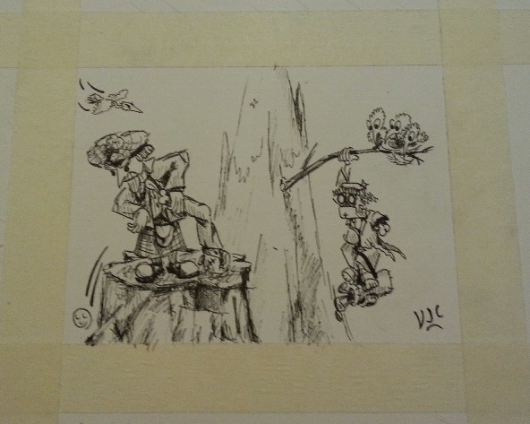
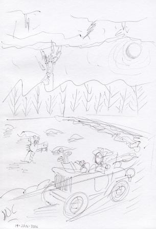
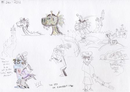
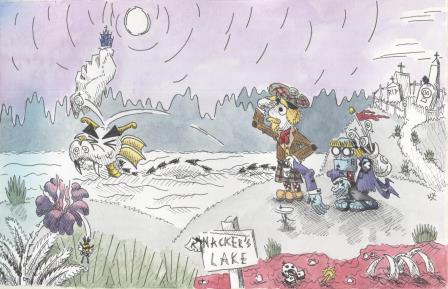
How about something with those two characters from Tee Off at Knackers Lake? Ok, I'll work on that.

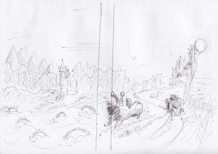
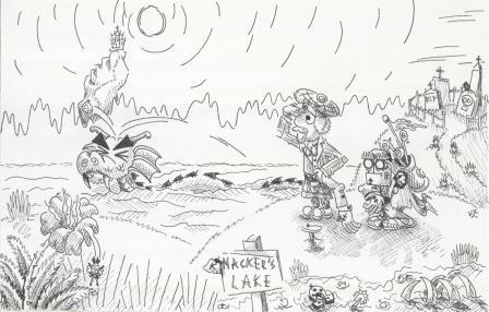
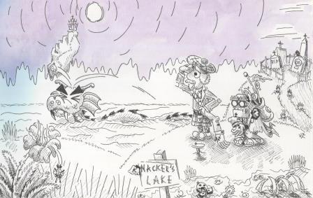
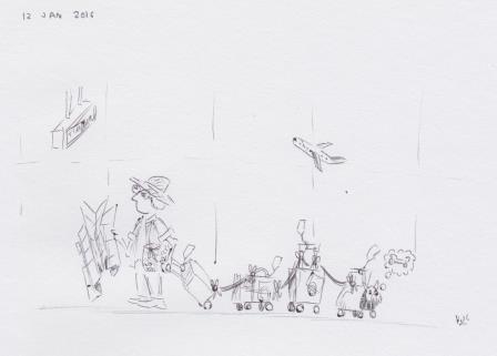
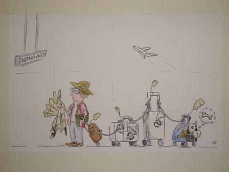
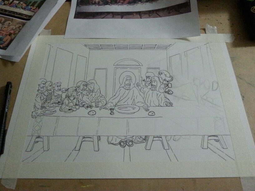
Here's a photo of the drawing after I finally had something I was happy to ink.
Picture
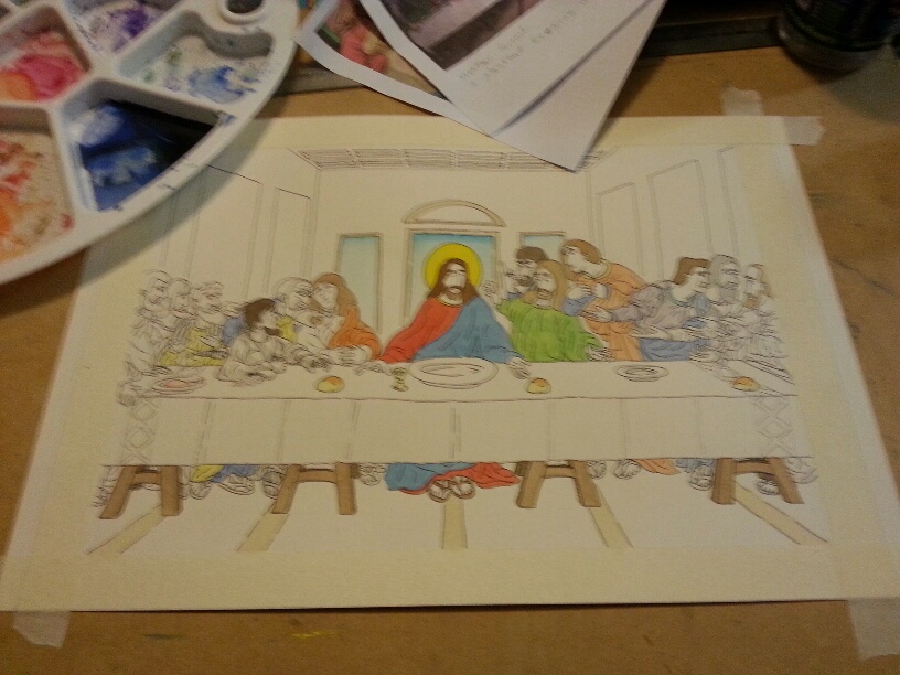
Now to start bringing them to life with a bit of colour.

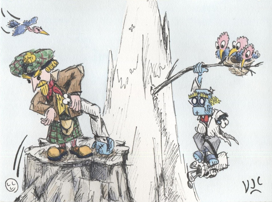
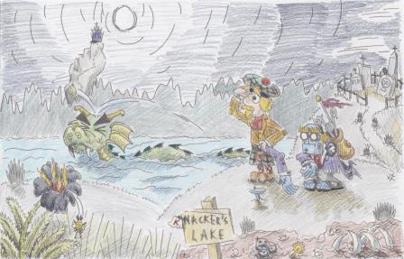
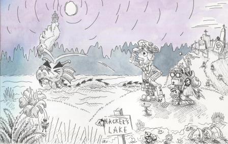
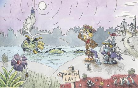
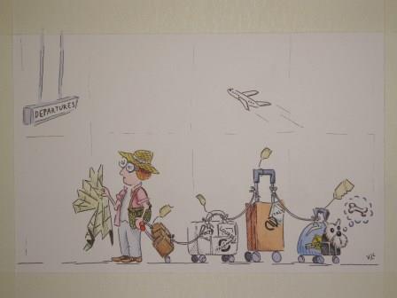
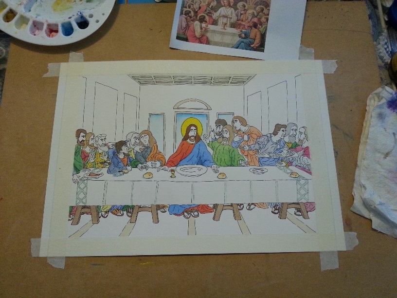
Here's what it looked like after the first series of watercolour washes:
Picture
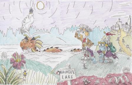
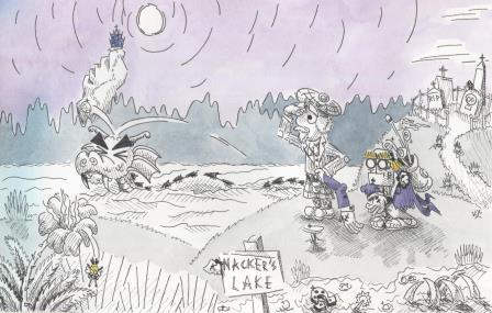
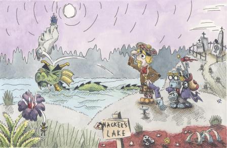
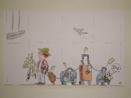
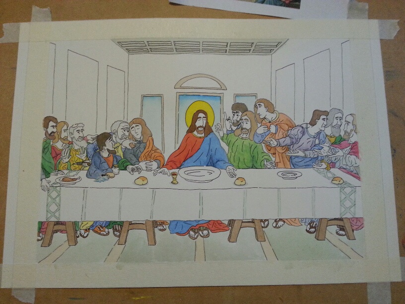
And after the second series of watercolour washes:
Picture
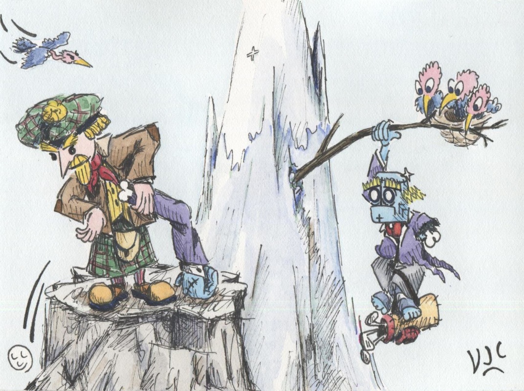
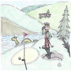
It was about this point that it got named 'Highland Golfing'. Our Scot still seems to prefer his robot's arm to the rest of his golf clubs, and one wonders what will happen to our long suffering robot caddy when the fourth bird adds weight to the branch.

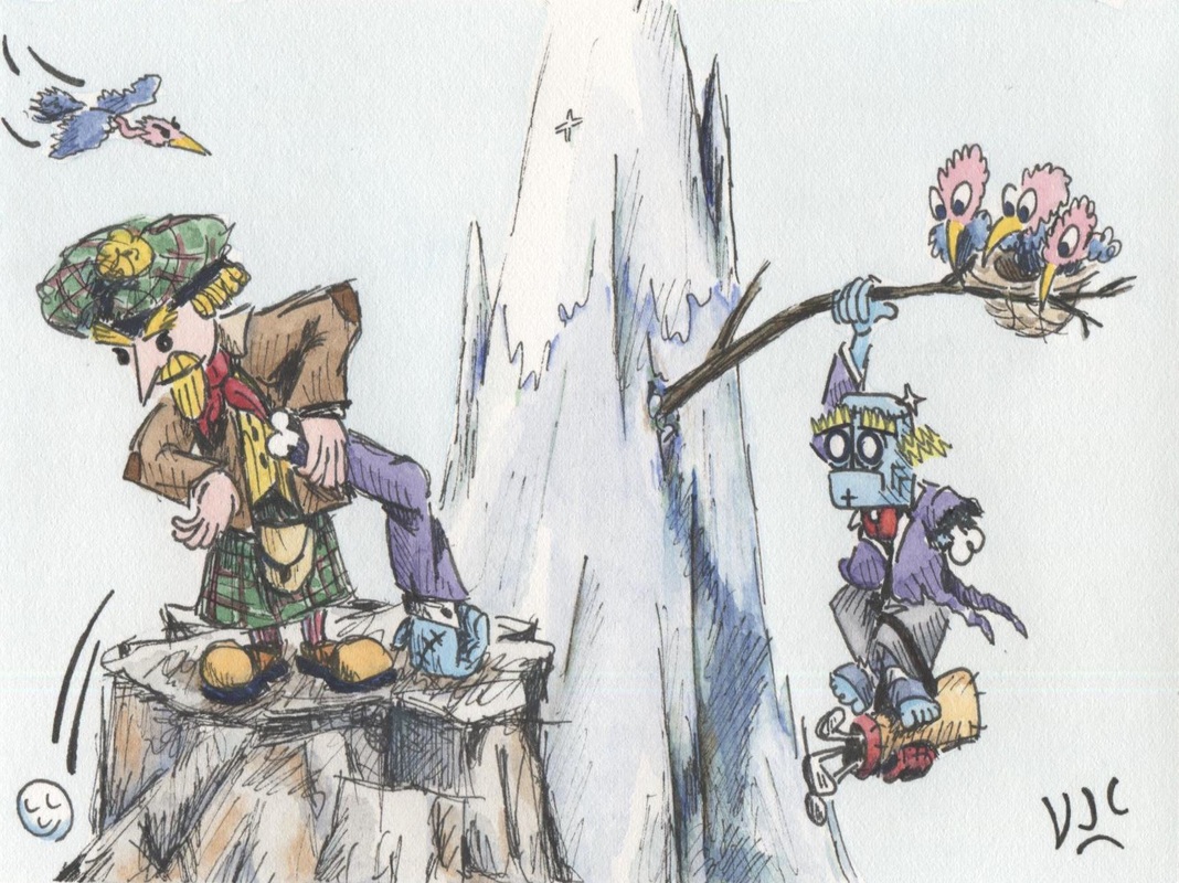
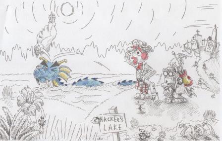
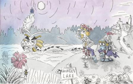
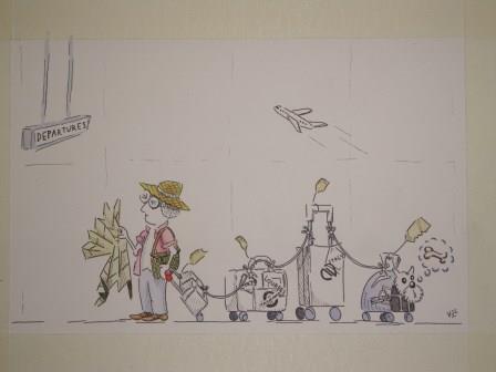
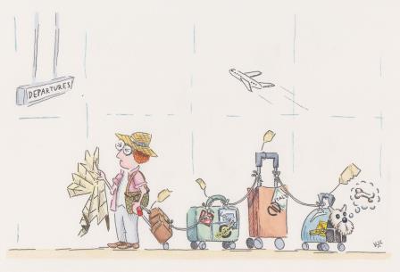
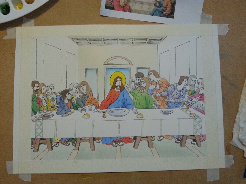
​And the final result:
Picture
Gee it was hard parting with the original.

Now for the fun of seeing what happens next, and hoping the original finds an appreciative home.
0 Comments

Tee Off At Knackers Lane

1/26/2016

0 Comments

 
This is the story of how my latest picture came to be.

It started last Tuesday. I decided to revisit some ideas I had back in April 2012 in my visual art diary. Here's what I drew back then. I called it 'A Scot Golfing'.
Picture

Lots of people liked that picture. So I experimented on a few sheets of cartridge paper. Here's the first sketch...our new scanner is more powerful than the previous one, so it looks a bit more smudgy where the paper isn't completely flat. 
Picture
I then thought about how that idea might look as a book cover, hence the book spine lines.
Picture
Then I played around with how some of the elements would look, the dragon, the robot and the golfer.
Picture
That got me to the drawing. Here it is inked and ready for colour.
Picture
There's no point having a great drawing, and then ruining it with poor colour choices. So I scanned the ink version, and then printed out three copies. Once I located my Fabel Castel coloured pencils I started doing some colour experiments.

While I would have preferred a more obviously night time image, it wasn't working too well. 
Picture
So I tried twilight instead, and that was a bit easier to see foreground, middle ground and background.
Picture
But I still wasn't happy with the dragon colours, nor the robot's golf bag. 
Picture
With the colour tests done, I had a better handle on how I wanted the final picture to look. Now it was watercolour time. Here's the first wash. The blue cast to the left is where the paper was buckling despite being taped down.
Picture
The second wash dealt with the forest on the other side of the lake.
Picture
Now I've done some of the middle ground, and have begun the golfer and the robot.
Picture
It is starting to come together with some yellows, crimsons and light blues.
Picture
Now the foreground is beginning to take shape and our golfer and robot have more character. Instead of choosing a golf club, he's used the robot's arm instead.  
Picture
The tombstones are done, the dragon has a bit more colour and the foreground plant is more finished.
Picture
A bit more work, and then some paper flattening, and here's the final picture.
Picture
I'm happy with the finished result. This is the kind of work I like doing. With this week-long picture completed, I can begin working on my correspondence Diploma in Illustrating Children's Books via the London Art College.
0 Comments

Some Cinema4D creations

1/18/2016

0 Comments

 
During my Diploma in Graphic Design we only had a term learning about Cinema4D. In the weeks since the Diploma course finished I have been experimenting with Cinema4D and seeing what I can do with it.

The first one is a robot character
Picture
The second one is a rocket cum satellite. The background is an image from Creative Commons.
Picture
And the last one is having a go to see what bits of a suit of armour would look like.
Picture
I've had fun doing them.

I've also been working on my resume. If you know of anyone looking to employ someone like me, please show it to them.
vincent_cavanagh_resume_6jan2015.pdf
File Size: 261 kb
File Type: pdf
Download File

0 Comments

Departures

1/15/2016

0 Comments

 
It has been good to get back into drawing and painting this week. The inspiration for this picture is my aunt's upcoming birthday. She has been doing a lot of travelling of late.

​Here's the initial sketch 
Picture
By the time this next photo was taken, the picture had been redrawn to fit A4, inked and the watercolour work begun. 
Picture
Colour on the first suitcase and a bit more on the dog carrier...
Picture
Colour on the third suitcase...
Picture
Colour on the second suitcase...
Picture
Final art, ready to become a birthday card...
Picture
0 Comments

Diploma Portfolio Exhibition

11/28/2015

0 Comments

 
This week was exhibition week for all those finishing their Diploma in Graphic Design at Hornsby TAFE. Of the students who started back in February, 15 were portfolio ready in time for the exhibition.

Here's my poster and table set up for the exhibition:  
Picture
And here's a slideshow of the exhibition:
And a very compressed PDF copy of the 18 pages in my portfolio on display for this exhibition: 
vincentcavanagh_2015_portfolio_final_artwork_smallestfilesize.compressed.pdf
File Size: 4976 kb
File Type: pdf
Download File

Like me, I am sure that my fellow students are relieved to get this far, and yet a bit uncertain as to where the next steps will take us. We had great teachers, particularly David Pix, Howard Binns-McDonald, Graeme Behrens and Keith Needham. 
0 Comments

Industry Connect 17 Nov 2015

11/18/2015

0 Comments

 
The Theme for this Industry Connect session at St Leonards TAFE on 17 Nov 2015 was Design Process. Each of the three speakers were asked to share case studies of the design process on a recent project.
​
Those that came to Industry Connect had the opportunity to see the graphic design portfolios of the students completing their Bachelor degree. Behind the lecture seating you should be able to see big white plinths. Each student had one of these to display their work on.
Picture
The first speaker was Catherine Van Der Werff. You can find out more about her on LinkedIn, Behance and can follow her on Twitter @CATVDW .
​
Catherine hails from New Zealand, and studied at the Auckland University of Technology. She has been in Sydney for 7 years and works at RE as a design director specialising in branding.
Picture
For her case study she chose the pitch preparation for the rebranding of the city of Dubai. Many other firms were pitching for the same brief.

Research: You have to become an expert in whatever the brief is about. She shared with us many fun facts about Dubai paired with photographs.

Audit: Find out what others have done with similar briefs and work out who has done the best job and why. The NYC branding for New York City and the stylised M for the City of Melbourne were looked at in detail, and information was gathered on how the City of Dubai is currently branded.

24 hour crit: Which are three 8 hour days devoted solely to generating ideas. It is like a bigger version of the exercise where you divide a page into 8 sections and have to draw a different chair in each one of them – it forces you to find more interesting solutions.
​
Concept development: Of all these ideas, two or three are chosen for development. The initial concept was Dubai Rising. Through mood boards, sketches and mock-ups many ideas were played with to see what would work. This included thinking about how those designs would look on collateral (buildings, vehicles etc).

Concept refinement: The tagline became Dubai Inspires. Each logo and sub-logo had a motion graphic story and iconic image inspiring it. The project went through at least 20 rounds of changes following feedback.

Realities: All projects have unique challenges. This project was an international one that needed communication between branch offices, head office, the agency managing the pitch bids and the gate-keepers to the ultimate client.

Lessons: Successful City branding requires that the black & white logo is just as recognisable as the coloured one. You have to think just as much about how to sell your concept to your client as developing the concept itself. Research the ultimate decision maker, likes, dislikes and how that person makes decisions. You learn from every job you do, even if it doesn't go into production.

......................................................................................

The second speaker was Jo Roca. You can find out more about her at her website http://joroca.com/, on LinkedIn and vis Twitter @Johi .
​
Jo specialises in creative strategy, ideation and concept development at For The People Agency. She comes from Colombia and has worked internationally. For The People started around a year ago. The agency uploads podcasts of conversations between co-workers and family to document the ups and downs of being a startup agency. The podcasts are called By The People. The agency prefers to find entry level staff through the incubator method; giving them a brief to complete within a week.
Picture
For her case study she chose a pro bono project for the charity Sydney Dog and Cats Home. They find homes for homeless dogs and cats, operating on a shoestring budget, in Spartan conditions, 5 paid staff and 200 volunteers. Most animal residents find homes within 2 weeks. Recently the owner of the premises they use decided to repurpose the land and the organisation needs to find a new home and lots of funds.

Research: To discover what online assets they have now, and how similar organisations (RSPCA) have marketed themselves. Usually the approach has been to evoke pity for the animals.

Idea: To do things differently, and treat animals like celebrities – after all some of the most popular content on the internet contains dogs and cats.

The visit: You can't begin to understand an organisation and its needs until you visit it. Frequently this becomes a reality check. It is a low tech operation with a cost-effective black & white printer.

Engagement: Two ideas were developed for engagement; a logo generator for dog and cat faces, and a magazine called Drool to be funded by Kickstarter and potential sponsorship.

Photography: Getting photos that show the personality of dogs and cats is an art form. You need a good photographer, treats, peanut butter to lick, squeaky toys, belly rubs and at least one volunteer who is familiar to the animals.

Lessons learned: Working with charities is good for the soul, but bad for the weekend. What a designer can dream, a web developer may not be able to do (or do within budget). Any website has to be mobile friendly - as a top priority. Work out how to make the work you have done sustainable for the charity and for the charity's budget.

.....................................................................

​The final speaker was Mike Tosetto, who specialises in Motion design and Promo Animation. He also spoke at the previous Industry Connect on 29 Oct 2015. You can find out more about him and his work on Vimeo, at Behance, on LinkedIn and via Twitter @MikeTosetto .

Picture
For his case study he chose a project for Royal Salut whisky, because it is an example of how free work brings in paid work.

Free work, a.k.a. side projects or personal projects are really important. They are a chance to have fun, to develop skills, to collaborate with others, to have full creative freedom and to have something fresh to add to your reel. You learn more from doing a side project than from doing a tutorial because when you have to solve problems when you come to them you never forget the solutions.

Mike showed us a selection of his side projects: a sequence with a dragon that he collaborated on with an illustrator friend and a music-audio friend; a two-colour grid animation with homage to old arcade games; and an animation about triangles and a pyramid that plays with the AGDA award logo. All of them have been very useful through social media for getting his name and work out into the public square.

The fourth side project he showed us landed him a big design job. Based on his personal interest in whisky and his desire to get better at 3D animation Mike made an info-motion about how whisky gets made.

e wanted it to be elegant, beautiful, subtle and magical. It took research, and problem solving to render the 3D in a special way and to incorporate live action element.

About a year later A+B Studio gave him a call, and said that Royal Salut had loved this side project video so much that they wanted him to do a project for them. They had a new product coming out, with an unusual whisky blending method.

The brand guidelines they sent Mike were over 200 pages long. He further researched the tasting notes and photo styles for the brand. Getting the story board right took about 90 versions, and there was extensive and frequent feedback to incorporate into the project. It sometimes felt like the hours he spent on emails was greater than the hours spent on producing the promo animation.

Lessons learned: With bigger and longer projects the creative director can change and the new person in the role is likely to make changes. Keep effective records of which requests you have and haven't worked on – putting 'DONE' at the end of each completed change request will save a lot of time in the long run. When you are sub-contracting out parts of the project you need to be very sure that you have terms and conditions in place that satisfy everyone's intellectual property requirements.

.................................................................................

To find out when the next Industry Connect is, keep an eye on https://www.facebook.com/designnorth.nsitafe/
0 Comments

Projects nearing completion

11/17/2015

0 Comments

 
The end of my Diploma year at Hornsby TAFE is in sight. Two projects are ready to hand in, and five more need to be completed before the week is out.

One of these is the project using Adobe Muse to build a small business website. Mid-project the web-hosting service our class was going to use got hacked, so sadly we won't get a chance to test the website in live mode.

For this project I am building an author website for myself. Here's what the home page design currently looks like: 
Picture
It still needs a small slideshow of illustrations from Book 1 to replace that greyscale landscape, and it needs links to book samples.

That's where this blog-post comes in. I need some URLs for the book samples, and the easiest way to do that is to upload the samples on this website.
vjcsampleplatoonbook1pdf.pdf
File Size: 291 kb
File Type: pdf
Download File

That way, when you click 'Read' the writing sample will open.
vjcsampleplatoonbook2pdf.pdf
File Size: 51 kb
File Type: pdf
Download File

Every little bit of progress towards completing this project is important.


0 Comments

Industry Connect 29 Oct 2015

10/29/2015

0 Comments

 
This afternoon I went down to the St Leonard's TAFE campus to listen to three people working in the graphic design industry. It was really interesting stuff, but due to the pressure of project deadlines most of my diploma class at Hornsby elected to go home and work on them rather than going down to St Leonards.

Here's a picture of everyone waiting for the talks to start while they sorted out some technical difficulties:
Picture
The first speaker was Mike Tosetto, a motion designer.You can find out more about him at his website ​http://www.miketosetto.com/ and on Twitter @MikeTosetto 
Picture
Here are some highlights from all three speakers:

Mike took a while to find out he loved working in motion graphics. That happened through one of the classes he took as part of a Design Science degree at Sydney Uni.

His first graphic design job was as a junior in a production studio. That job had excellent variety. From there he moved to a job with a local branch of Interbrand where he developed expertise in motion for branding. Having always done a bit of freelance work as a sideline, Mike noticed that freelance requests were growing and decided a year ago to go freelance full time.

It has been a steep learning curve going freelance. He's learned to pay close attention to contract terms and copyright regulations and has discovered that all jobs experience hiccups of one kind or another.

Success requires not only technical expertise, but life skills and communication skills too. You need to be easy to work with. You also need to get yourself out there, with a website, social media, and opportunities to network naturally with people.

The rarer your technical skills are, the more in demand you will be.

Remember these great quotes: 'We work with people not with portfolios' and 'There is always work for talented people'.

It's OK to charge a significant premium for a rush job, and if a client wants access to your source files then you should charge for that separately to the original job.

............................................................................................

The next speaker was Gavin Smith from Fox Sports' augmented reality team.

He, too, took a while to discover his skills in graphic design. Gavin started out in carpentry and building and studied graphic design as a mature age student. He loved it. When his teachers suggested he interview for a junior position in broadcast software at Channel 10, he landed the job. 
Picture
On the job you learn so much more than you can at TAFE. Initially he worked in pre-production graphics for news bulletins. With several news bulletins each day, it was important to learn how to design, animate and deliver 6 second graphics within a 6-7 hour (or less) turnaround window and to be available for shift work.

A few years into the job new software came along called Vizrt and revolutionised the television industry. With this software you could do template based work in 3 dimensions and real time rendering. Gavin upskilled himself quickly on this software and began teaching his colleagues how to use it.

Not long afterwards Fox decided that they wanted to grow their in show promotions and that it would be cost effective to have a full time in-house designer than outsourcing it. Gavin's boss took that post, and Gavin joined that team a few years later. These days he works on the graphics packages for 16 of Fox Sports magazine shows.

Having a good skill set is not enough. In order to succeed you need a good work ethic, willingness to work extra hours and to nurture relationships with the people you work with. No one likes to work with a grumpy person or someone who complains all the time.

For someone with a good background in Aftereffects the transition to Vizrt is easy. Currently there is a massive shortage in people with Vizrt experience both locally and globally.

.......................................................................................

​The final speaker was Dave Foster a Type Designer, lettering artist and calligrapher. You can find out more about him at his website  http://fostertype.com/ and on Twitter @fostertype

Picture
Type designers give visual form to language. Letters are like the Lego bricks of culture. Dave is very happy to be contributing to that history and tradition.

He loves where utility and beauty overlap. With type designing he feels that he can continue learning forever, because no one knows where the top of the mountain of possible knowledge in this field actually is. He loves doing quality work, even when no one notices.

Dave thinks there will always be a need for type designing, because unique people need unique fonts to express themselves with.

Type is a systematic thing, and re-usable. It is concerned with how letters look next to each other. It is a synergy of technology, language and design.

Calligraphy is writing, not drawing.

Lettering is usually a few words needed for a specific context, like a logo. 

To create a font with all its associated glyphs takes between 4 months and 4 years. For each font you need uppercase and lower case, punctuation, numbers, mathematical symbols, currency symbols,numbers designed specifically for tabular use, superscipts, subscripts.uppercase diacritics and lowercase diacritics. A good quality typeface requires at least 500 glyphs. 

Yet the most important of them all, for legibility, is the width of the space bar. The space between words determines how comfortable or uncomfortable it is to read your font. Bad letters spaced well are more legible than good letters spaced poorly.

A type designer has to consider a myriad of corrections required by optical illusions. If it looks wrong, then it needs to be changed.

Once the font looks right, it is time to start thinking about kerning. This requires going through at least 5000 glyph combinations and adjusting for around 1500 exceptions.

..........................................................................................

To find out when the next Industry Connect is, keep an eye on https://www.facebook.com/designnorth.nsitafe/
0 Comments

Last Supper

9/27/2015

0 Comments

 
This picture was entered in the 2015 Gosford Art Prize, and will be exhibited in the Imperial Centre, Gosford in late October as part of the Overflow Exhibition.

It began as a request from a friend, and was done on A3 Arches paper 300g Smooth. The first step was to look at how the great painters had tackled the Last Supper for reference.

Wanting to reduce framing costs (if deemed necessary), it had to get squeezed into 28cm x 38 cm to suit a 40cm x 50cm frame. 

In the photo below you can see that most of the ink work has been done, with snatches of the reference material nearby.
Picture
This next photo is a bit blurry, but the ink work is done and the watercolour work is well underway.
Picture
In this one the outer Apostles are closer to being finished.
Picture
Now the floor is completed.
Picture
And the back wall and ceiling.
Picture
The side walls and the front of the tablecloth.
Picture
Here is the scan of the finished picture, which is quite washed out compared with the photographs.
Picture
And here's the final result, after Greg Coates worked his framing expertise on it. It proved to be difficult to get a photo without some stray ambient glare, despite using my camera tripod.
Picture
One of the people who visited my exhibition at The Community Gallery last month liked this Last Supper enough to ask for 6 greeting cards to be made - and came back the next day to purchase them.
0 Comments

Exhibition photos and media

8/29/2015

0 Comments

 
My art exhibition at the Community Gallery at Gosford Regional Gallery from 21-23 August 2015 went well, but there were a large number of people who for various reasons were unable to attend. 

So for those who were unable to come, this blog-post is primarily for you, although for the rest of us it is a chance to re-live it.

First up is a look at what the exhibition space looked like before the hanging of artworks started. 
Picture
And here is a slideshow of what it looked like once the hanging was finished. Although there is one picture missing (Child's Bedroom) and the majority of the plinths are not in position. 
Here is a 5 min 36 sec video of the exhibition, beginning from my earliest 2011 works and going through to the latest 2015 works.
The speeches were on Saturday 22 August at 11.30am, and my dad Paul Cavanagh started them off. Then I had a few words, and mum had the last word or two. The cake was an original creation by Alisha Harwood and tasted great. 
The video below is 5 min 41 sec long and contains those speeches.
In this next photo you can see the plinths for the guest book, the sign up sheet for notification when my book gets published and the sign up sheet for my 8 times a year newsletter. Please use the Contact page if you would like to add your name and email address to any of those sign up sheets, or the Comment section below in lieu of a guest book.
Picture
If you would like to know more about individual artworks the following two documents will help. Each one has a thumbnail of the artwork together with a brief description of it. These were the labels under each artwork, colour coded for year of creation.
vjcexhibitionlabels2011to2013webebook.pdf
File Size: 1518 kb
File Type: pdf
Download File

vjcexhibitionlabels2014to2015webebook.pdf
File Size: 1452 kb
File Type: pdf
Download File

Over 370 people viewed the exhibition over the weekend. A little over 100 greeting cards were sold, together with at least 6 of my 2016 calendars, and a very pleasing number of artworks were sold to family and friends.

My special thanks firstly to my parents and grandparents who helped so much in setting the exhibition up and manning it. Other special thanks to the members of the Central Coast Art Society, the members of Hospital Art and the members of the Children's Book Writers and Illustrators of the Hunter and Central Coast who came to support me. To family and friends who traveled some distance to come, my thanks to you as well.  
0 Comments
<<Previous

    Cavanagh Art

    A place to share the occasional bit of news and how the process of my art development works.

    Archives

    February 2016
    January 2016
    November 2015
    October 2015
    September 2015
    August 2015
    July 2015
    May 2015

    Categories

    All
    Book Samples
    Career Development Case Studies
    Central Coast Art Society
    Cinema4D
    CYA Conference
    Departures
    Design Process
    Exhibition
    Exhibition Slideshow
    Exhibition Speeches
    Exhibition Video Clips
    Experimental Fun
    Gosford Regional Gallery
    Gosford Show
    Graphic Design Case Studies
    Graphic Design Diploma
    Graphic Design Portfolio Exhibition
    Highland Golfing
    Hornsby TAFE
    Image Process
    Industry Connect
    Ink And Watercolour
    Last Supper
    Motion Graphic Design
    Postcard
    Resume
    Steampunk Castle
    Tee Off At Knackers Lake
    The Adobe Muse Project
    The Community Gallery
    Twitter
    Twitterartexhibit
    Type Design
    Whimsy

    RSS Feed

Powered by Create your own unique website with customizable templates.