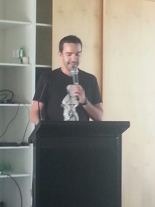
This week was exhibition week for all those finishing their Diploma in Graphic Design at Hornsby TAFE. Of the students who started back in February, 15 were portfolio ready in time for the exhibition.
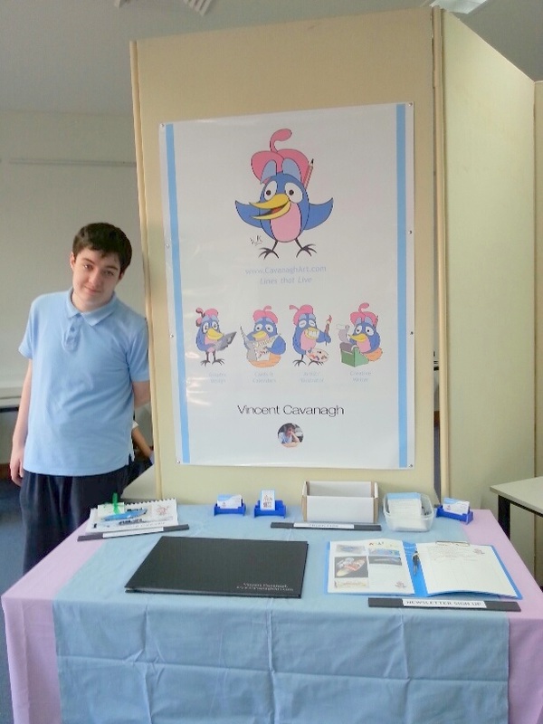
Here's my poster and table set up for the exhibition:
Here's my poster and table set up for the exhibition:
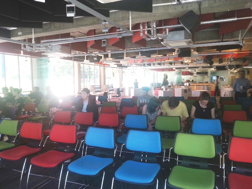
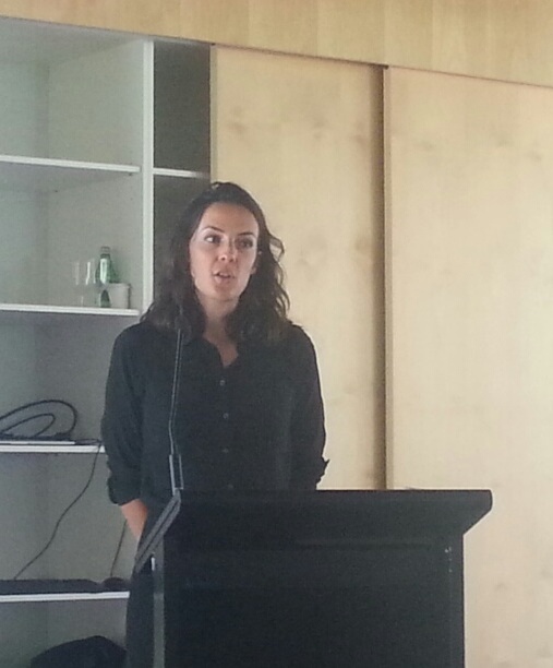
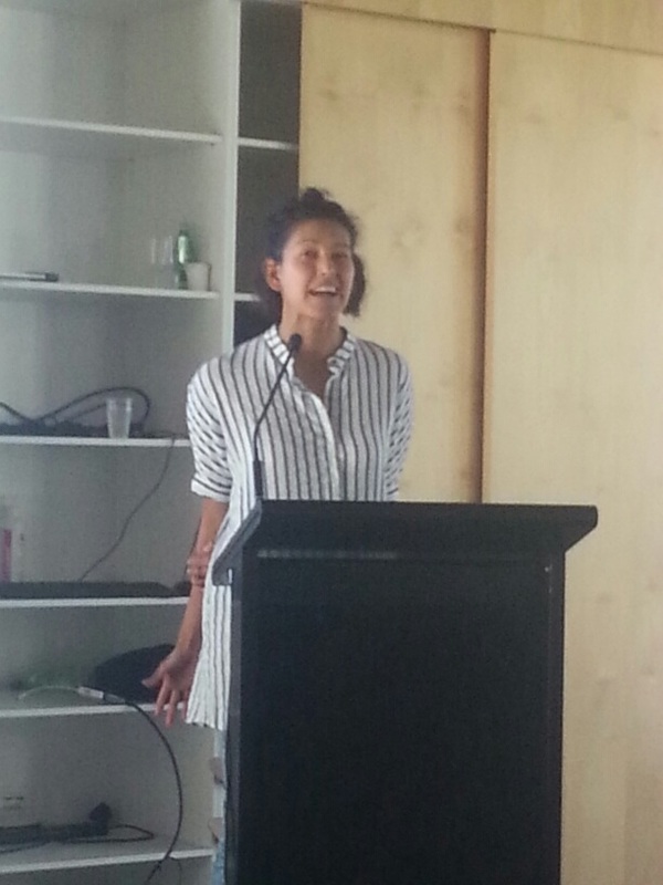
And here's a slideshow of the exhibition:
And a very compressed PDF copy of the 18 pages in my portfolio on display for this exhibition:
| vincentcavanagh_2015_portfolio_final_artwork_smallestfilesize.compressed.pdf |
Like me, I am sure that my fellow students are relieved to get this far, and yet a bit uncertain as to where the next steps will take us. We had great teachers, particularly David Pix, Howard Binns-McDonald, Graeme Behrens and Keith Needham.
 RSS Feed
