This afternoon I went down to the St Leonard's TAFE campus to listen to three people working in the graphic design industry. It was really interesting stuff, but due to the pressure of project deadlines most of my diploma class at Hornsby elected to go home and work on them rather than going down to St Leonards.
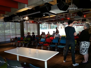
Here's a picture of everyone waiting for the talks to start while they sorted out some technical difficulties:
Here's a picture of everyone waiting for the talks to start while they sorted out some technical difficulties:
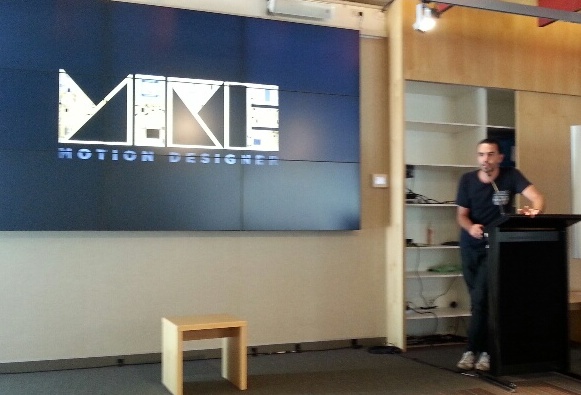
The first speaker was Mike Tosetto, a motion designer.You can find out more about him at his website http://www.miketosetto.com/ and on Twitter @MikeTosetto
Here are some highlights from all three speakers:
Mike took a while to find out he loved working in motion graphics. That happened through one of the classes he took as part of a Design Science degree at Sydney Uni.
His first graphic design job was as a junior in a production studio. That job had excellent variety. From there he moved to a job with a local branch of Interbrand where he developed expertise in motion for branding. Having always done a bit of freelance work as a sideline, Mike noticed that freelance requests were growing and decided a year ago to go freelance full time.
It has been a steep learning curve going freelance. He's learned to pay close attention to contract terms and copyright regulations and has discovered that all jobs experience hiccups of one kind or another.
Success requires not only technical expertise, but life skills and communication skills too. You need to be easy to work with. You also need to get yourself out there, with a website, social media, and opportunities to network naturally with people.
The rarer your technical skills are, the more in demand you will be.
Remember these great quotes: 'We work with people not with portfolios' and 'There is always work for talented people'.
It's OK to charge a significant premium for a rush job, and if a client wants access to your source files then you should charge for that separately to the original job.
............................................................................................
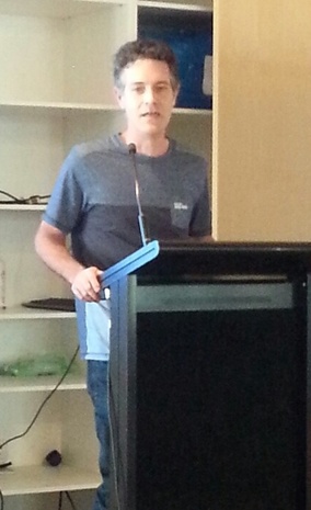
The next speaker was Gavin Smith from Fox Sports' augmented reality team.
He, too, took a while to discover his skills in graphic design. Gavin started out in carpentry and building and studied graphic design as a mature age student. He loved it. When his teachers suggested he interview for a junior position in broadcast software at Channel 10, he landed the job.
Mike took a while to find out he loved working in motion graphics. That happened through one of the classes he took as part of a Design Science degree at Sydney Uni.
His first graphic design job was as a junior in a production studio. That job had excellent variety. From there he moved to a job with a local branch of Interbrand where he developed expertise in motion for branding. Having always done a bit of freelance work as a sideline, Mike noticed that freelance requests were growing and decided a year ago to go freelance full time.
It has been a steep learning curve going freelance. He's learned to pay close attention to contract terms and copyright regulations and has discovered that all jobs experience hiccups of one kind or another.
Success requires not only technical expertise, but life skills and communication skills too. You need to be easy to work with. You also need to get yourself out there, with a website, social media, and opportunities to network naturally with people.
The rarer your technical skills are, the more in demand you will be.
Remember these great quotes: 'We work with people not with portfolios' and 'There is always work for talented people'.
It's OK to charge a significant premium for a rush job, and if a client wants access to your source files then you should charge for that separately to the original job.
............................................................................................
The next speaker was Gavin Smith from Fox Sports' augmented reality team.
He, too, took a while to discover his skills in graphic design. Gavin started out in carpentry and building and studied graphic design as a mature age student. He loved it. When his teachers suggested he interview for a junior position in broadcast software at Channel 10, he landed the job.
On the job you learn so much more than you can at TAFE. Initially he worked in pre-production graphics for news bulletins. With several news bulletins each day, it was important to learn how to design, animate and deliver 6 second graphics within a 6-7 hour (or less) turnaround window and to be available for shift work.
A few years into the job new software came along called Vizrt and revolutionised the television industry. With this software you could do template based work in 3 dimensions and real time rendering. Gavin upskilled himself quickly on this software and began teaching his colleagues how to use it.
Not long afterwards Fox decided that they wanted to grow their in show promotions and that it would be cost effective to have a full time in-house designer than outsourcing it. Gavin's boss took that post, and Gavin joined that team a few years later. These days he works on the graphics packages for 16 of Fox Sports magazine shows.
Having a good skill set is not enough. In order to succeed you need a good work ethic, willingness to work extra hours and to nurture relationships with the people you work with. No one likes to work with a grumpy person or someone who complains all the time.
For someone with a good background in Aftereffects the transition to Vizrt is easy. Currently there is a massive shortage in people with Vizrt experience both locally and globally.
.......................................................................................
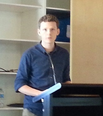
The final speaker was Dave Foster a Type Designer, lettering artist and calligrapher. You can find out more about him at his website http://fostertype.com/ and on Twitter @fostertype
A few years into the job new software came along called Vizrt and revolutionised the television industry. With this software you could do template based work in 3 dimensions and real time rendering. Gavin upskilled himself quickly on this software and began teaching his colleagues how to use it.
Not long afterwards Fox decided that they wanted to grow their in show promotions and that it would be cost effective to have a full time in-house designer than outsourcing it. Gavin's boss took that post, and Gavin joined that team a few years later. These days he works on the graphics packages for 16 of Fox Sports magazine shows.
Having a good skill set is not enough. In order to succeed you need a good work ethic, willingness to work extra hours and to nurture relationships with the people you work with. No one likes to work with a grumpy person or someone who complains all the time.
For someone with a good background in Aftereffects the transition to Vizrt is easy. Currently there is a massive shortage in people with Vizrt experience both locally and globally.
.......................................................................................
The final speaker was Dave Foster a Type Designer, lettering artist and calligrapher. You can find out more about him at his website http://fostertype.com/ and on Twitter @fostertype
Type designers give visual form to language. Letters are like the Lego bricks of culture. Dave is very happy to be contributing to that history and tradition.
He loves where utility and beauty overlap. With type designing he feels that he can continue learning forever, because no one knows where the top of the mountain of possible knowledge in this field actually is. He loves doing quality work, even when no one notices.
Dave thinks there will always be a need for type designing, because unique people need unique fonts to express themselves with.
Type is a systematic thing, and re-usable. It is concerned with how letters look next to each other. It is a synergy of technology, language and design.
Calligraphy is writing, not drawing.
Lettering is usually a few words needed for a specific context, like a logo.
To create a font with all its associated glyphs takes between 4 months and 4 years. For each font you need uppercase and lower case, punctuation, numbers, mathematical symbols, currency symbols,numbers designed specifically for tabular use, superscipts, subscripts.uppercase diacritics and lowercase diacritics. A good quality typeface requires at least 500 glyphs.
Yet the most important of them all, for legibility, is the width of the space bar. The space between words determines how comfortable or uncomfortable it is to read your font. Bad letters spaced well are more legible than good letters spaced poorly.
A type designer has to consider a myriad of corrections required by optical illusions. If it looks wrong, then it needs to be changed.
Once the font looks right, it is time to start thinking about kerning. This requires going through at least 5000 glyph combinations and adjusting for around 1500 exceptions.
..........................................................................................
To find out when the next Industry Connect is, keep an eye on https://www.facebook.com/designnorth.nsitafe/
 RSS Feed
